
SITO
Branding
OVERVIEW
This project had students develop a brand identity based on a certain industry given to them. I was given the food industry and created a concept, designs and a Graphic Standards Manual for a grocery store.
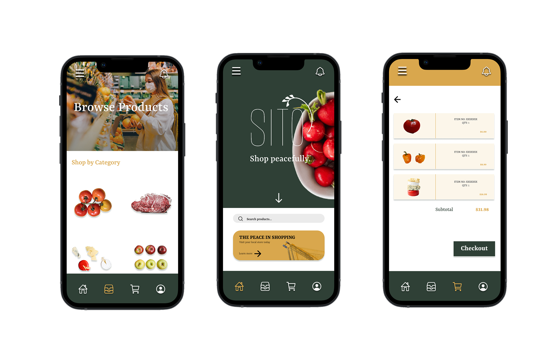
The grocery store, named SITO, will provide high-quality and organic products in minimal packaging. The store will offer a quiet experience for those who want to move away from grocery stores full of noise, intense imagery, and small children. Customers will be shopping in a quiet and soothing space, with softer music and subdued imagery. Due to the minimalism and simplicity of our store, customers will be able to find products quick and easy.


The finalized logo is inspired by the Greek Goddess, Demeter, the goddess of agriculture and depicted as the "Mother of the Grain." The name Sito is the root word that means grain or food. It suggests healthiness, high-quality and organic food.
STATIONERY

ADVERTISEMENTS


STORE SIGNAGE


MOBILE AND DESKTOP DESIGN

This project may contain copyrighted material, the use of which has not been specifically authorized by the copyright holders. This project is part of an educational exercise and is used for the purpose of teaching and learning under the fair use provision of copyright law.